Struggling to find the perfect font for your brand or product?
As any design geek will tell you, your font is more than just a pretty face. It’s a crucial component of your brand identity and how you communicate. Following the old adage, ‘it’s not what you say, but how you say it’, how you choose to visually depict the words you write to customers says a lot about your brand. While to many it’s a small detail, a good typeface is every bit as important as your logo, packaging or colour palette and will become a defining characteristic of your brand.
But how do you choose one right for you? Follow these tips below for discovering and crafting your perfect type.
1. Context
Context is everything. As you would have done with your packaging and collateral, you need to consider where your typeface will be seen and interacted with. Will it be next to competitor products or collateral? How do they look? Will you stand out? Consider all of the situations your typeface will exist in and how it should be shaped for impact.
2. Legibility
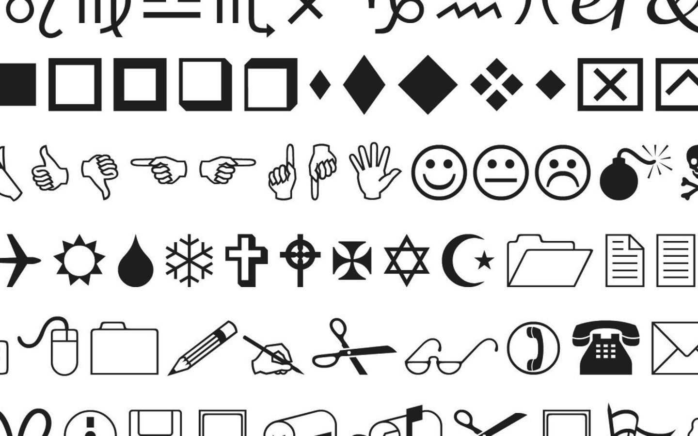
As Microsoft’s ‘Wingdings’ proved to everyone, not all fonts are created equal. Your typeface must consider the customer and context to ensure it can be read, digested and appreciated. For example, your font may be beautiful blown up on a piece of marketing collateral but how will it look on a tiny label? Ensure your font can be translated across all iterations while preserving its ability to be read and understood.
3. Personality
Your typeface should have personality. It should be consistent with your logo and be carefully considered as a key component of your visual brand identity. Apply the same rigorous planning you did to every component. This means moodboards, testing, tone-of-voice coherence and as above, context consideration. This will ensure your brand personality is not lost in translation.
4. Harmony
If you’re combining two or more typefaces you need to consider how you would like these to interact. Do you want harmony? Are you looking to create stark contrast? There are no rules, but each selection should be made in consideration of your overall brand identity when viewed in its totality. Focusing only on individual components can lead to oversight that creates unwanted clashes when you have to pair the fonts you’ve chosen.
5. Performance
Finally, consider how your font will perform in the digital space. Is your font web-safe? Can it be rendered perfectly in a browser? Form is great but function is necessary and having both will ensure your typeface can be displayed seamlessly and proudly where you choose to display it.
Need a little more help? Check out more of our work to see some of the brands we’ve helped to craft brand identities and typefaces that speak volume, and get in touch to discuss how we can do the same for you.


